Description
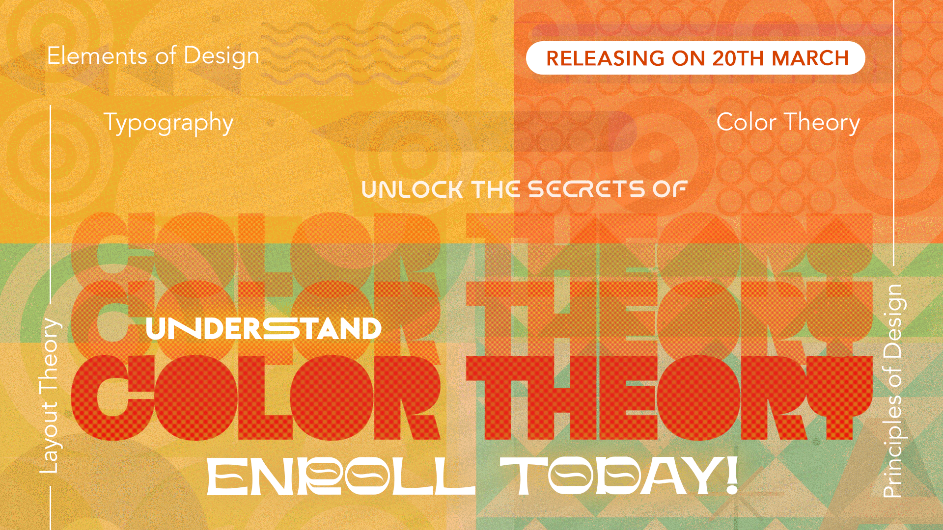
Color theory is a fundamental aspect of graphic design that deals with the use and interaction of colors. Understanding color theory is crucial for creating visually appealing designs, as it helps designers make informed decisions about color palettes, contrast, and harmony. In this article, we will explore the basics of color theory, including the color wheel, color harmony, color psychology, and color in design.
The Color Wheel
The color wheel is a circular diagram that organizes colors based on their relationship to each other. It is divided into primary colors (red, blue, yellow), secondary colors (orange, green, purple), and tertiary colors (red-orange, yellow-orange, etc.). The color wheel helps designers choose colors that work well together and create harmonious compositions.
Color Harmony
Color harmony refers to the pleasing combination of colors in a design. There are several color harmonies based on the position of colors on the color wheel:
- Complementary: Colors that are opposite each other on the color wheel, such as red and green, create a high-contrast, vibrant look.
- Analogous: Colors that are adjacent to each other on the color wheel, such as blue and green, create a harmonious, soothing effect.
- Triadic: Three colors that are evenly spaced on the color wheel, such as red, yellow, and blue, create a balanced, vibrant look.
- Split-Complementary: A variation of the complementary color scheme, using a base color and two colors adjacent to its complement, such as blue, yellow-orange, and red-orange.
Color Psychology
Colors can evoke different emotions and associations, known as color psychology. For example, red is often associated with passion and energy, while blue is associated with calmness and trust. Understanding color psychology helps designers choose colors that convey the right message or feeling for their design.
Color in Design
In graphic design, color plays a crucial role in conveying meaning, creating hierarchy, and guiding the viewer’s eye. Designers use color to differentiate elements, create emphasis, and evoke specific moods or emotions. For example, a call-to-action button may be designed in a contrasting color to stand out and attract attention.


Reviews
There are no reviews yet.